
of all media intractions are screen based
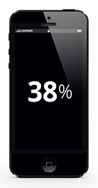
of our daily media intraction is through Smartphones
/>
Responsive Design
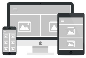
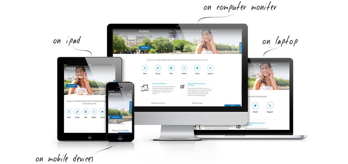
In this information & innovation age, the number of devices used to browse web is growing rapidly providing a plethora of screen sizes & resolutions. Responsive Web Design provides an optimal user experience on all kinds and sizes of devices from large screen desktops to small smartphones.
Our Web Design & Development team at iAppSys is adept in creating responsive web designs of the highest quality and details. The process of creating these responsive web designs involves 3 technical ingredients
Flexible Images
Images sized in relative units to prevent them from displaying outside their containing element.

Media Queries
A way to apply CSS rules to the page based on the size of the displaying browser.
So if you have substantial mobile traffic on your website or are looking to market to mobile web users, then a responsive site is a must and can definitely help give a good first impression of your company.
Using HTML5, CSS3 & Bootstrap framework our team can create a new responsive website or can transform your existing website to a responsive design.
Our quality assurance team ensures the website is working perfectly on all the screen sizes providing an optimum user experience.
Mobile Website
Mobile site is accessed via a different URL. Most website automatically redirect you to a different URL when browsing from Mobile.
Content & Look of the mobile site is different from the desktop website. It’s usually a sub-set of the main desktop website.
Analytics tracks the mobile site & desktop site separately.
Load times are comparatively faster as it’s a sub-set of the main site so less information.
Responsive Website
Responsive Website is accessed via the same URL across all devices. It automatically adapts to the screen size.
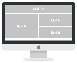
It’s the same look & feel, auto re-arranged based on flexible grids. Its the same content.
Same analytics tracks everything since it’s the same website.
Load times can be relatively more for large websites as there may be a lot of content showing up on smartphones.
